2010年10月6日水曜日

DVD Package


Hi,

So, I choose this movie trilogy for my project.

GAMERA: The Guardian of the Universe


GAMERA 2: Attack of Legion


GAMERA 3: Awakening of Irys


"Gamera" is one of the Japanese famous monster movie seires as like Godzilla.
The original movie series started from 1965 and ended in 1980.


The main monster, Gamera, is a huge turtle-like monster.
It is a friend of human being and saves people from Evil Monsters or Aliens.


The three movies I chose are new series from 1995 to 1999.

Their plots are...

     1: Gamera, a good montser which created by Atlantis Civilization, wakes up to defeat Gyaos, the evil bird-like man-eater which also created by Atrantis.


     2: An alien insect-like creature,  Legion, has arrived to the Earth and attack human being. Gamera against the monster to protect the Earth.


     3: Ayana, a girl whose parents were killed by Gamera accidentally in the first movie, finds a egg of Gyaos' mutant. She named the new Gyaos as "Irys" and breeds it to revenge Gamera.


I have sound truck CD of this movie, so I'm gonna add bonus truck CD for my project.
 I will make actual 3 DVDs with new desing, each cases, and also make a special edition box.


2010年10月4日月曜日

The Visual Design of Package

Hi,


This is the packaging design for the paper cover of my bottle.

The circle and rectangle inside of the design will be die cut.

2010年9月15日水曜日

Group 2 Crit

This is how to make my new bottle for CHOYA's Plum Wine!

Bottle

This terrible picture is the second draft of the bottle.
I chose its design from my thumnails.


The bottle is see-through, so you can see the inside (plum and liquid).
The liquid is light-brown, and plum is green.
Also, I will paint the bottle cap as light pink.

These colors represent Ume flowers on a tree as like this.


How can I make the bottle?
I use sculpting and mold casting.

First, I am going to make a sculpture of bottle.
Then make molds with liquid rubber.
Finally, I will cast a copy of the bottle which made of liquid plastic called "resin."

Paper cover

I will make paper cover as like this.

It's really difficult to see it,
but the side is made by four thinner recrangles.
I will add simple picture or photograpgh of Plum.

2010年9月8日水曜日

Thumnails

The first picture is about bottle designs.
I'm going to use clay and silicon to make a mold, and cast it using with resin (liquid plastic).

I have Four ideas.

1) twisting shaped bottle
2)sports drink bottle-like shape
3)cube head
4)Diamond-cut

Also, I will add CHOYA's logo on the top of the bottle cap.

In addition, this is about paper cover.


The left one is a paper cover that just cover only head part of bottles.
The reason why I chose head cover is to show the bottle's design.
If the cover is wider than the bottles and can be connected each other as like the picture of left,
I think it is possible to protect bottles and easy to bring.

The right side one is really looks like the original paper cover,
but there is a hole inside of the front to show also the bottle design.

2010年8月30日月曜日

5 Minutes Presentation.

I chose this for my presentation of Project 1.


Choya "Umeshu -Plum Wine-" Small Size


Who is "Choya" ?


Choya Umeshu Co. Ltd. is one of the Japanese fruit liqueur companies.
According to its history, the company founded in 1914 with making grape wine,
but they started their plum wine (Umeshu) in 1959.

The name of the company comes from a town called Choya, in Osaka.
"Cho" means butterfly, and "Ya" means arrow.
That is why their logo is "a butterfly has sharp wing"

Now, Choya has a great share of the Japanese plum wine market.
Also, they export their product, Umeshu, to more than 47 countries 
such as the US, China, Germany...

What is "Umeshu"

Choya's "Umeshu" is Japanese Plum Wine made from 100% Japanese Ume (plum).
Choya has several types of bottles by its size.

Upper: big bottle with plums
Lower: big bottle without plums


You can drink and enjoy it as you want such as straight, hot, or on-the-Rock
But the small bottle is specialized in straight.


Who is the Audience?


 Umeshu is loved both men and women, young and old.

But its majority of the audience is women.
Because of its sweetness and drinkability, Choya's Umeshu is pleased by them.

In Japan, by the way, Choya makes its TV commercial with actresses

15sec.
http://www.youtube.com/watch?v=odi21go78wU&feature=related

30sec
http://www.youtube.com/watch?v=u-9r9FkmG4U&feature=related

According to those commercials,
it is possible to say that Choya itself knows their target is women.

Competition

There are some kinds of Umeshu in the US liqueur market.


Top: "Akadama Plum Royale"
Left: "Plum Gekkeikan" by Gekkeikan
Right: "Kinsen Plum" by Kinsen

Those three are the example of Umeshu competition you can get in America.

Gekkeikan's design is OK, but the other two, especially Kinsen, are little bit boring.

Why I Chose Choya?

     Choya is one of the biggest Japanese liqueur companies as like Sapporo or Kirin in the Japanese market; also the audiences of the US can find and drink it on the US because it's exported.

     However, its packaging design is busy with its small typography and boring by its too simple bottle even though the main target is women customers. Also, because of the green colored bottle, Choya cannot appeal the inside of bottle; plum.

     In addition, the paper cover of small bottle is so weak to protect the products.
Strategy

1,  Make a simple, clean, and charming bottle.
   -Appeal customers, especially non- Japanese women, that they can drink it by straight.
   -To get more share on the US as an inported item.
   -Hint: perfume bottles


2,  Make a paper cover also simple, but has presence and toughness.
   -To protect grass bottles, and also appeal to women customers to get it easy.

3, Think about Cost
   - It's imported item, but cheap ($2).
   - Must think the new package same cost.

2010年8月25日水曜日

Good and Bad

Hi people!

These three are my favorite Good Designs

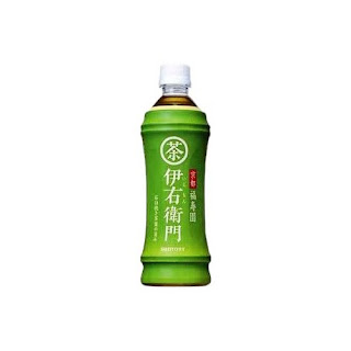
"Iemon" Japanese Tea
This is a Japanese bottled tea called "Iemon."
Shape of bottle is bamboo! Long time ago, bamboo was used as water bottle as like below.


"Gatsby -Moving Rubber-"

This is Japanese hair wax.
The upper is bigger size and lower is small one.
They represent its size by using a capital or small letters.
Also, the packaging color may change depends on your hair style.


"VOSS"
Why I chose Voss because I have bought this by its bottle design.
It is possible to say that Voss success to represent the image of purity water by bottle.


Unfortunately, they are Bad Designs, I think.

Arizona
These packages are so busy.
Also, the fonts "Arizona" is overrapping with pictures of tree. I think that is the one of the reasons why I feel "busy" on this.


Vegetable Seeds

I found it in Japan, but I felt this desing is cheap-looking.

Emergen-C
It has funny name, but the package design is mediocre and boring.
They should use new packaging which is more simple but has strong impact as like its name.

My Works.

These are samples of my previous works!

Sculptures


Graphic Design
Make Up


Test.

Test, test,test...