Hi people!
These three are my favorite Good Designs
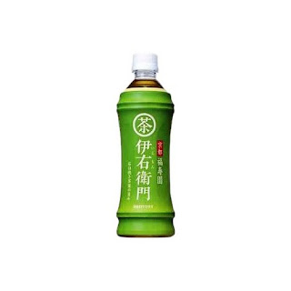
"Iemon" Japanese Tea
This is a Japanese bottled tea called "Iemon."
Shape of bottle is bamboo! Long time ago, bamboo was used as water bottle as like below.
"Gatsby -Moving Rubber-"
This is Japanese hair wax.
The upper is bigger size and lower is small one.
They represent its size by using a capital or small letters.
Also, the packaging color may change depends on your hair style.
"VOSS"
Why I chose Voss because I have bought this by its bottle design.
It is possible to say that Voss success to represent the image of purity water by bottle.
Unfortunately, they are Bad Designs, I think.
Arizona
These packages are so busy.
Also, the fonts "Arizona" is overrapping with pictures of tree. I think that is the one of the reasons why I feel "busy" on this.
Vegetable Seeds
I found it in Japan, but I felt this desing is cheap-looking.
Emergen-C
It has funny name, but the package design is mediocre and boring.
They should use new packaging which is more simple but has strong impact as like its name.


I actually own those purple and pink hair waxes right now :P
返信削除Plus I drink that VOSS water everyday :P and I put that as good design on my blog also :)
-Sungmin